Logos
Click on a logo below to learn more about my process with each design.


Construct AI Logo Redesign

Overview:
Construct AI is a start-up company that focus's on construction project management and construction workers needs. They believed their current logo didn't represent the brand properly and was outdated. As a result, I was asked to create a new logo that inviting, professional, modern, and that could be used on their website and app. For this redesign I was tasked to use their current colors and font (Roboto).

Duration:
Team:
My Role:
April, 2022
Madison Korteling
Graphic Designer
Previous Logo
This was the previous logo used to represent Construct AI. They liked how their current logo combined brains with construction, but thought it missed the mark when it came to bring a modern take on technology in the construction industry.

Sketches
After brainstorming with the company, they liked the idea of incorporating CAI into the logo. Within my sketches I produced different designs with the abbreviation, and also found ways to also bring construction into the logo through the use of blades.
Different Logo Options
After deciding on a specific direction, I began creating the logo digitally. I explored the idea of having the C in the logo be a blade and incorporated different thickness and styles.

Final Logo
After presenting different logo options to Construct AI they decided upon this logo. They liked how the logo would be recognizable even in smaller sizes and how versatile it could be within different branches of the company. To learn more about Construct AI visit their website down below, as well as view some of my UX/UI work within the company.

Miwork Life Logo Creation

Overview:
Miwork Life is a new company created by Construct AI. Miwork Life's mission to create a soical media platform for people in construction to share work and network with others in the industry. As a new company, Miwork Life wanted a logo that was modern, simplistic, and strong.
Duration:
Team:
My Role:
August 2021
Madison Korteling
Graphic Designer
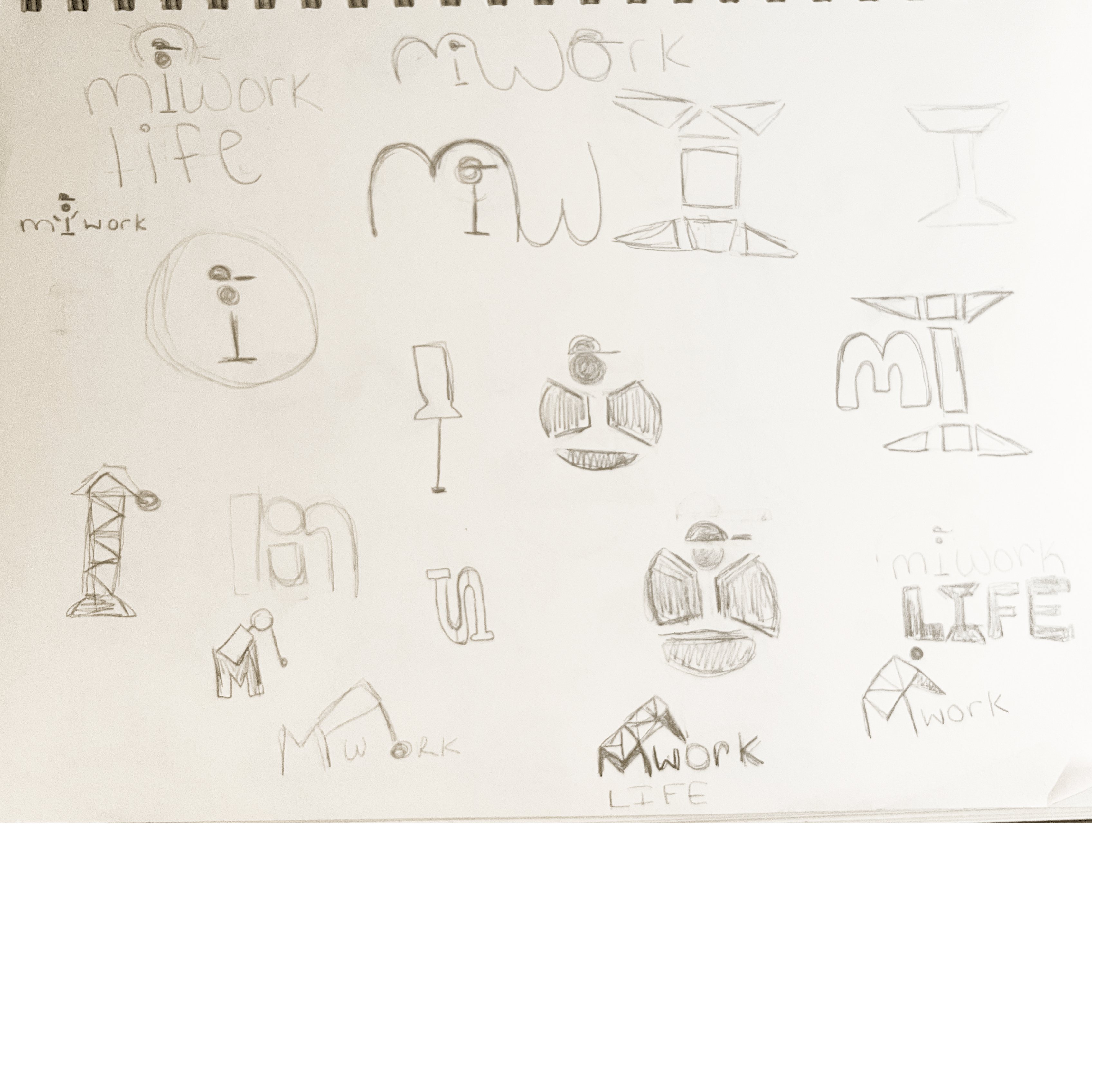
Sketches
In the beginning stages of my process I played around with the 'i' in Miwork Life to represent a worker or the letter 'y'. But I found that creating a logo that was more of a statement and simplistic would fit more of the companies needs.

Different logo options
After sketching I put together a group of options to present to the company. They preferred the logo on the top right, and liked the dark grey with the yellow and but wasn't 100% sold. From there I created different versions this logo and landed to land on theo final logo design.
Final Logo
Below is the final logo that Miwork Life choose. It combines their original needs of wanting a strong, powerful, modern look that would appeal to workers in construction. Throughout this process, I had a lot of fun exploring different options and doing a project outside of my usual design work. Miwork Life is still in a start-up phase but to learn more about the company or see some of my UX/UI work done for them check out their website below!

Carbone Building Company Logo Creation

Overview:
Carbone building company is new company started by the founder of EGM Builders. Their goal was to create a logo that was clean, simple, and easy to use for branding.

Duration:
Team:
My Role:
April 2022
Madison Korteling
Graphic Designer
Sketches
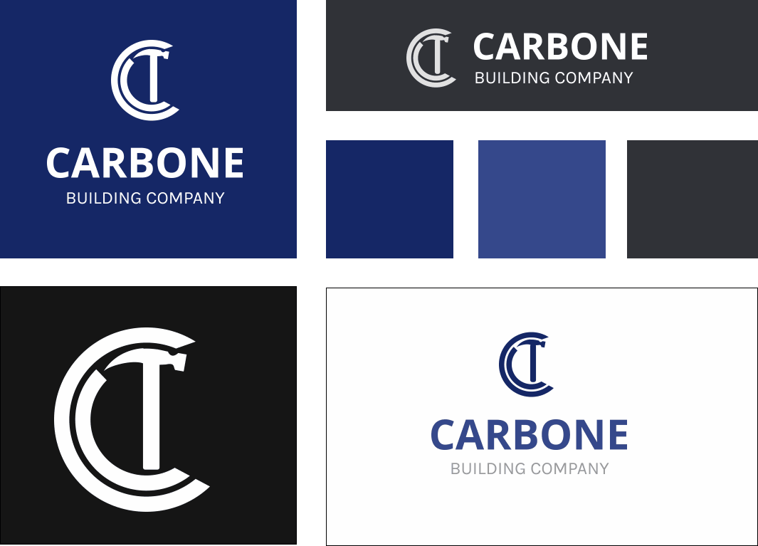
When searching for inspiration, I wanted a logo that was not too complex and that would fit in the construction industry. When speaking more with the client they liked the idea of incorporating the letter 'C' in their logo. With that in mind, I sketched out some more ideas using a 'C' and some recognizable tools in construction.
Options presented
After sketching I presented 4 different options to my client, with different ways to use each logo and color options. They liked the dark blue and grey of the logo options and decided upon a final design.
Final Logo
Following a discussion Carbone Building Company, they choose this logo. They liked the simplicity of the design, the subtle use of the letter 'C' and the readability of the font. Overall this logo was a fun project to work on and the client was pleased with the final result.
