Energy.gov Redesign
How might we improve the overall branded experience of Poshmark so that the app is easily accessible, and more brand loyal amongst the social commerce retail industry.

Energy.gov is a government site that seeks out information to ensure America’s security and prosperity by addressing its energy, environmental and nuclear challenges. However, their navigation of the site has made it difficult for users locate topics that they are looking for. With a plethora of information, and secondary navigational items, users end up feeling overwhelmed and frustrated.
The Problem:
The site contains a wealth of information on various topics, but visitors have a hard time finding information and navigating through the site. How might we make the UI more user friendly and have an overall easier flow when looking for specific information?
The Goal:
As a team we plan to redesign the current navigation of Energy.gov to be more intuitive and easy to navigate. We also plan on creating a cohesive style and branding that wont take away from the information on the site.
Project Duration:
Team:
My Role:
Key Skills:
February 2021 - March 2021, 1 month
Team of 3 for User Reseach
Madison Korteling- Website and app design
UX/UI Designer
Card Sorting
Heuristic Evaluation
Prototyping
Information Architecture
Our Solution:
Through this case study, we heavily focused on information architecture, hierarchy, and creating consistency. Within the current site, users were left feeling overwhelmed by information and confused how to go get to their end destination. Through our research and design process we strived to fix these pain points and create a seamless design.
User Research Plan


Mobile and Website Wire-framing
At this point in our process our group was responsible for creating our own designs. For my wire-framing I focused on the layout of the homepage, and navigation of the website and app first before moving into other areas of the site.
Style Guide
On the current Energy.gov's site, there was a lack of a clear design style, and consist font. As a solution, I choose to add one accent color ( green) to not distract for the information of the site. Green was the perfect color to use because it's earthy and environmental tone. For a font style, I choose an san-serif font that would be easy to read with a lot of information
Colors

Button States

Icons

Colors

Font

App Responsive Design:
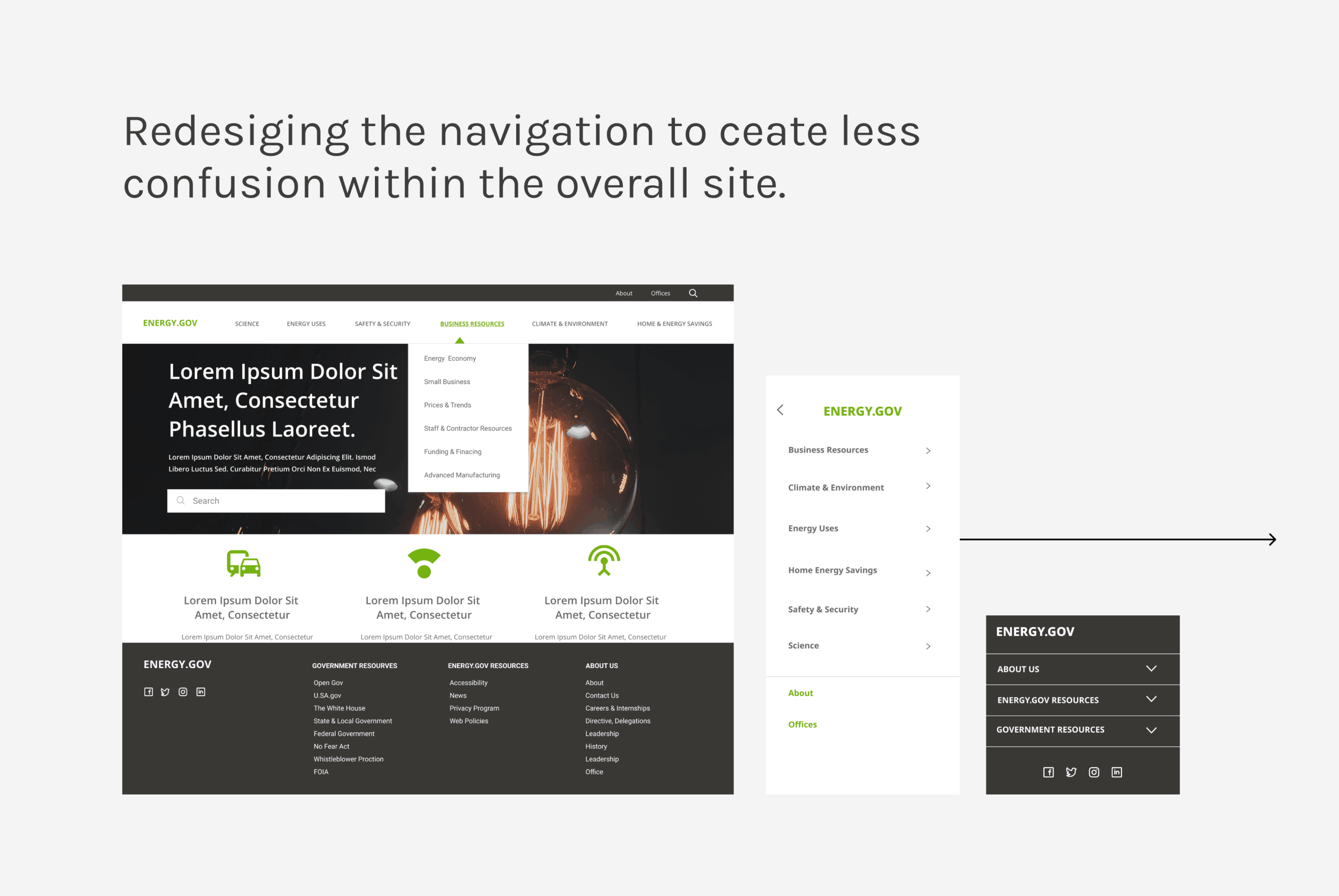
My main goal for the mobile application was to have a clear navigation and access points. For this example, the user is accessing information about Energy.gov's energy saver section. I created drop downs in the navigation for easy access and also included a second navigation within Energy Saver. By doing so, it highlighted the main categories and make it easier for user's to find information they are looking for.
Website Respinsive Design:
In Energy.gov's website it navigation was also imperative aspect of the design. In the screen recording I provided a clear top navigation, footer and categories on the home page. I also included a flow of a user trying to access information about Energy Saver. In this section, I constructed a secondary navigation to create hierarchy, and importance.
A/B Testing:
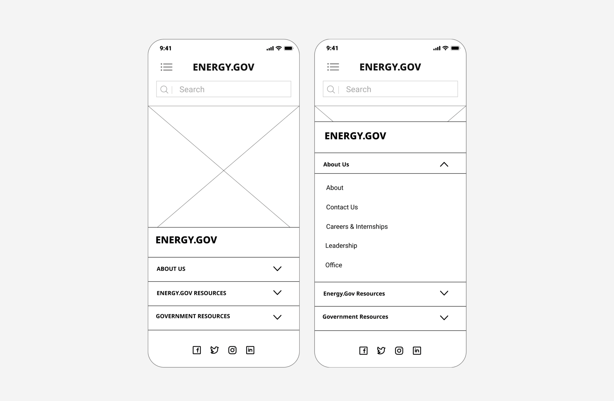
For the mobile application I conducted an A/B test for the navigation due to the mass amounts categories in a small space. Version A shows a navigation that is full screen with drop downs and Version B displays a navigation that is not full screen and brings the user to a secondary screen for the drop down categories. After testing, the majority of users found Version A more accessible and easy to use.


Usability Testing:
Our usability testing focused users navigating to different categories of the website to make sure our restructure of the navigation was easier to follow. Through my testing I found key iterations to make to the navigation even easier to use.
1. find how to save energy by heating and cooling for your home
2. Find out about small business
3. Find out where you would access information about the energy blog on the website
4. Find where someone would go to if they wanted to find out about Energy.gov’s careers and internships
Notes:
-
Users had some difficulty navigating through the mobile version than the desktop
-
The mobile version had too much text and users felt like they had to do a lot of reading
-
The placement of the categories were easy for users to find on mobile and desktop
-
Users felt like options stand out more, things were blending together
Iterations:
-
Simplify the mobile homepage by taking away text on when needed.
-
Making things stand out more on the mobile device
Final Thoughts
Overall thoughts:
If I had more time, I would have added more content to the homepage and secondary pages, in addition to add micro-interactions.
The biggest challenge for me was categorizing all the content together. A lot of thought and testing went into the navigation alone because of the mass amount of categories and information.
Additionally I learned the importance of simplifying mobile sites. Through my user testing I found users had a harder time navigating the site on a mobile device, then on the desktop. Simplifying content and having a clear flow is very important on mobile especially. In the future I would simplify the mobile pages even more than what they are now. This project taught me the significance of card sorting and responsive web design.